Descriptive Statistics#
Encounter with Penguins#

You have finally found a colony of the legendary space penguins. These creatures seem to be comfortable spending lots of time in water. They also seem to be very resistant to cold. And they eat fish! Moreover, the penguins seem to be rather intelligent. Establishing communications with them could be fun.
But you decide to start with a preliminary scan of the colony:
import seaborn as sns

df = sns.load_dataset("penguins")
The goal of descriptive Statistics#
Once your data is tidy and you have created a few exploratory plots, you usually want to describe your data in more detail. This is where Descriptive Statistics come in. This is an obligatory step whenever you are working with data whether you want to deliver an expert opinion, train a fully automated Machine Learning algorithm or monitor data in production. Statistics go very deep sometimes, but you can safely start with a few metrics. You find an overview here.
A good step to start with is to write down questions you are interested in. E.g.:
how many penguins are there?
how large are the beaks of penguins?
are there any subgroups of penguins?
are there any exceptionally small or tall penguins?
The descriptive statistics metrics help you to come up with answers that are numbers. Let's look at a few of them.
Measures of Centrality#
When looking at a single variable (a column in your tidy data), the first thing you want to know is where the data is located. The three metrics to start with are:
The arithmetic mean#
The arithmetic mean is the sum of all data points divided by their number:
df["bill_length_mm"].mean()
Often, you want to separate your metrics by categories:
df.groupby("species")["bill_length_mm"].mean()
Note
pandas by default puts out numbers with maximum precision.
In a report this can be very misleading and suggest your calculations are more precise than they actually are.
Use round() or f"{number:6.2f}" to round the numbers. One or two decimal places are usually enough.
The median#
The median sorts the data points and then takes the point in the middle (or the average of two if the number is even).
df["bill_length_mm"].median()
The median is less prone to outliers than the mean. Try adding a godzilla-sized penguin to the list and see how both metrics change.
The mode#
The mode is simply the most frequent value of a variable. It makes more sense if your variable is an integer, ordinal or category value, and less with float scalars.
df["species"].mode()
In a scalar variable, you would also want to check if there are multiple modes. Use the histogram for that:
df["bill_length_mm"].hist(bins=20)
Measures of Spread#
The second aspect of a single variable is how much it is spread around the center. Again, you have several options that are complimentary:
The range#
The range is simply the word used by statisticians for the distance between the minimum and maximum value.
range = df["bill_length_mm"].max() - df["bill_length_mm"].min()
The standard deviation#
A metric less prone to outliers is the standard deviation, or the square root of squared distances from the mean:
An intuitive description of the standard deviation is that roughly 67% of the values are within one standard deviation from the mean, assuming a normal distribution (sorry it does not get more intuitive than that).
df["bill_length_mm"].std()
The standard deviation is also the square root of the variance (which is used less frequently).
Quartiles and everything#
Quartiles are the ranges in which portions of 25% of the data are found. You can calculate these and lots of other statistics with a one-stop function:
df["bill_length_mm"].describe()
Distributions#
A key question in the first two parts is: Does my data consist a homogeneous group or does it really consist of two major sub-groups. Without going into the details of testing statistical hypotheses (which is very difficult to do right) you may want to start with examining the histogram of a variable. What you want to check is:
is there more than one group (monodal, bimodal or multimodal distribution)?
is there a predominant distribution?
You should be able to distinguish the following distributions visually: uniform, normal, standard normal and power-law (long tail) distribution.
We will examine them more closely in a later chapter.
Normalize#
Sometimes it is easier to analyze data if you transform it before analyzing. Normalizing is a generic term that refers to all kinds of mathematical transformations. Some frequent normalization procedures are:
calculating percentages against a mean value
scaling the data to values from 0.0 to 1.0
scaling the data to a standard normal distribution (mean 0.0 and standard deviation 1.0)
taking the binary or decadic logarithm of all values
We will look at normalizations in a later chapter more closely as well.
Correlation#
When you want to describe more than one variable, things obviously get more complicated. Here are two things to start with:
Inspect a scatter plot#
In a scatter plot, you want to check if there are any visible sub-groups, linear or other correlations or if the data is simply a cloud of dots:
sns.scatterplot(data=df, x="bill_length_mm", y="bill_depth_mm", hue="species")
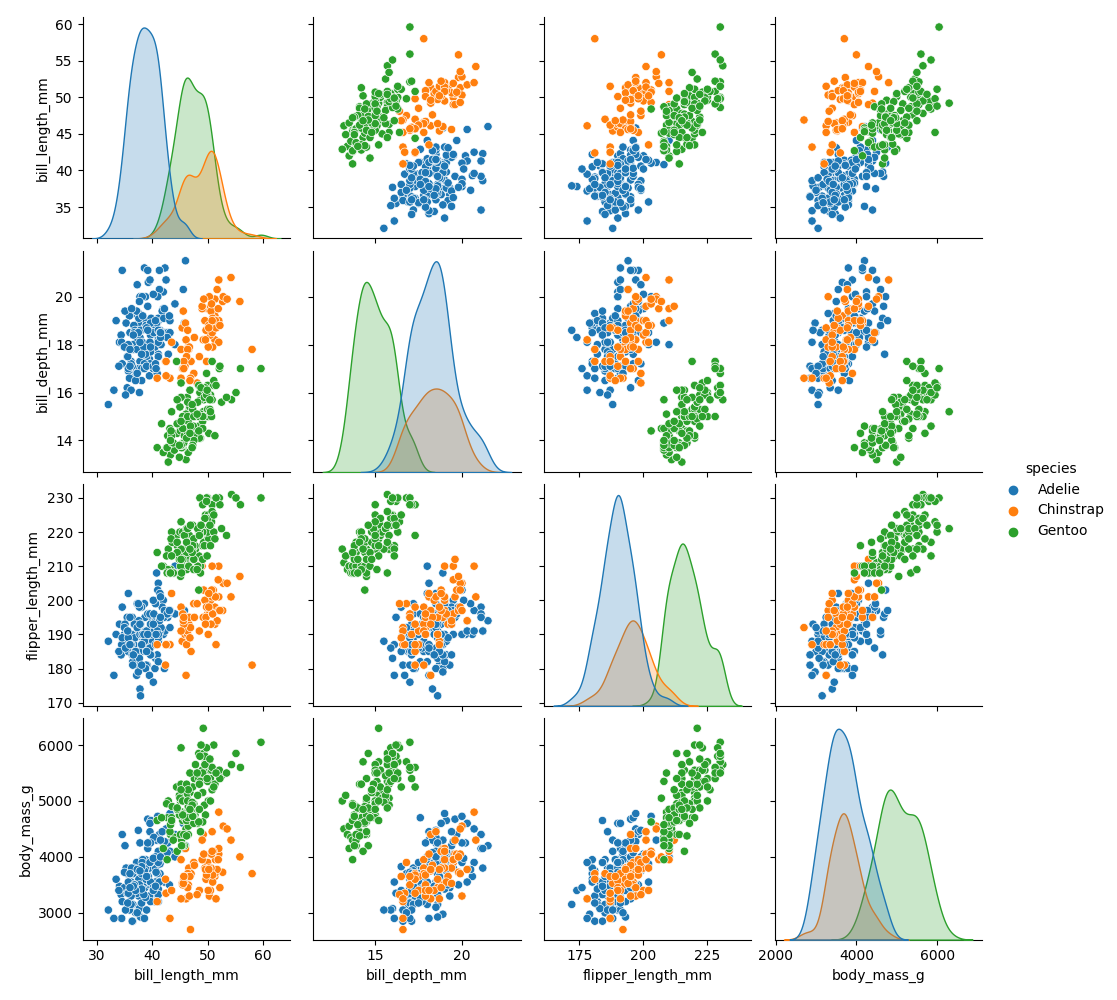
To go for a full swing, try the pairplot:
sns.pairplot(df, hue='species')
Correlation coefficients#
A correlation coefficient describes what proportion of one variable can be explained by the other using a linear model. The correlation coefficients mean roughly:
value |
meaning |
|---|---|
1.0 |
perfect positive correlation |
0.0 |
completely random |
-1.0 |
perfect negative correlation |
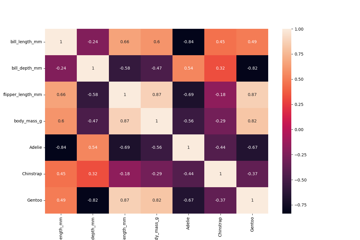
Calculating correlation coefficients for all scalar columns in pandas is easy enough:
df.corr()
If you want to correlate the categorical data as well, you need to use One-Hot Encoding:
species = pd.get_dummies(df["species"])
df2 = pd.concat([df, species], axis=1)
Warning
Correlations can be very easily misleading. See next section.
The correlations can be plotted very nicely if you make some extra space for the labels:
plt.figure(figsize=(12,8))
sns.heatmap(df2.corr(), annot=True)
See also
Confounding Factors#
If the data has significant subgroups, the correlation coefficients might not give you the full picture. The underlying groups might be more important than the actual correlation. In that case, the groups are called a confounding factor. Confounding factors can blur the information in a correlation coefficient or even turn it around!
Identifying confounding factors is not easy and often not visible from the data alone. This is why domain expertise is indispensible!
See also
Recap Exercise: Descriptive Statistics#
First, load the penguin dataset:
import seaborn as sns

df = sns.load_dataset('penguins')
Solve the following tasks:
# 1. calculate the total weight of all penguins
...

# 2. calculate the mean flipper length over all penguins
...

# 3. calculate the median flipper length over all penguins
...

# 4. calculate the standard deviation of the flipper length
...

# 5. calculate the correlation between flipper length and body mass
...

# 6. count the frequency of each penguin species
...

# 7. calculate min, max and quartiles over all columns
...