Climate Stripes#
In this exercise, you will reproduce the famous climate stripe cover from the Economist.
Step 1: Get climate data from ECAD#
go to www.ecad.eu
go to “Daily data”
click on “Custom query (ASCII)”
set fields as in the table:
field |
value |
|---|---|
Type of series |
blend |
Country |
|
Location |
|
Element |
Mean temperature |
click on “Next”
click on “Download” and download the data
Warning
The ECAD data is made available for public use. However, do not redistribute the raw data (on your GitHub profile or elsewhere).
Step 2: Read the data into a DataFrame#
Reading the ECAD data into pandas is a bit trickier than a standard CSV file. You will need to inspect the file in a text editor (not Excel). Pay attention to the following:
what is the column separator?
are there any headers?
how many lines contain comments before the real data starts?
Look up the parameters of pd.read_csv(). They are sufficient to read the file.
Step 3: Data Wrangling#
The TG column contains the temperature measured in 0.1 Celsius degrees. This was probably established decades ago when disk space and memory were more expensive (integers take less space).
Create a new column by dividing the temperature by 10.
Plot the raw temperature data as a line plot.
Step 4: Time Axis#
The DATE column contains timestamps in the YYYYMMDD format.
You need to convert these to pandas timestamps.
First, convert the DATE column to a string data type.
Second, use the following expression to slice off year, month and day:
df['year'] = df[col].str[x:y]
Put the elements into separate columns. Then, create a new date column via string concatenation:
df[col1] + '-' + df[col2]
The final date column should have the format YYYY-MM-DD. Now you can convert the strings with dates into a timestamp index with:
df.set_index(pd.to_datetime(date_series))
Plot the temperature as a line plot again. Now, the x-axis should look much better.
Step 5: Missing Values#
For some cities, the data may contain missing values. In the original
files the value -9999 is used. This can be done with the
replace() method:
df[col].replace(-999.9, new_value) # after scaling
As a new value, use the overall median temperature. Place the result of the expression in a new column.
Hint
Instead of the median, you could average over the year before and after the gap or take the mean of exactly the same day of the adjacent years.
Step 6: Cut off the last year#
Before calculating median temperatures, make sure the last year is complete as well. It can be cut off by slicing the index with a simple date string. Pandas takes care of the parsing:
df.loc[:'2021-12-31']
Step 7: Aggregate#
Now reduce the data to one value per year using the median. This could
be done with a df.groupby():
df.groupby('year')[col2].median()
However, with a timestamp index it is better to use df.resample():
yearly = df.resample(freq='Y').median()
The resampling has the advantage that you still have a timestamp index after the operation.
You may want to create a DataFrame out of the series:
df = pd.DataFrame(yearly)
Plot the aggregate as a line plot again.
Hint
You may want to try out resampling different frequencies.
pandas understands frequency values like '3M2d5h10sec'
See Offset Aliases for a list of all options.
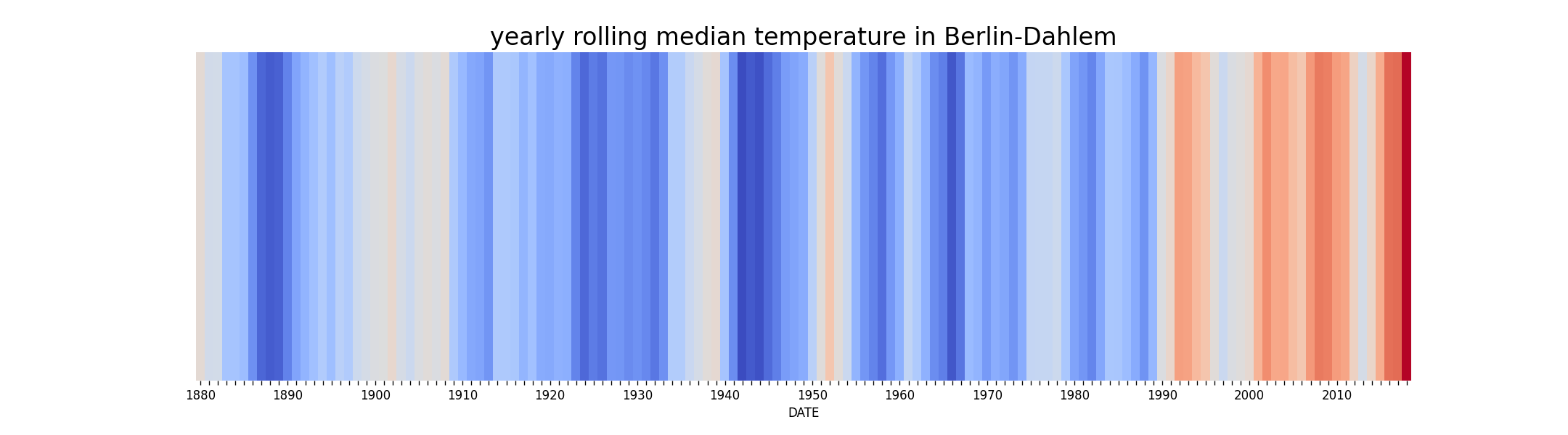
Step 7: Heatmap#
The seaborn library has a heatmap function that you can use to plot
the stripes.
cmap = plt.get_cmap('coolwarm')

plt.figure(figsize=(15, 5))
plt.title('yearly median temperature in Berlin-Dahlem')
sns.heatmap(df, cmap=cmap, cbar=False, yticklabels=[], xticklabels=[])
Save your stripe image to a file.
Hint
make sure that your data is a single-column DataFrame
try
df.transpose()if you want to have the stripes the other waybefore plotting, setting the index to the year makes nicer tick labels.
if you put a typo in the name of the color map (coolwarm), matplotlib prints the available options
of course you could download multiple files and create a diagram with multiple rows of stripes
Bonus: Smoothing#
Before the resampling, you may average over a 5-year window (rolling mean):
ts = df['temp'].rolling(window=5 * 365).mean()
ts.plot()
Compare the resulting heatmap.